Define
After completing the Self+ project, our team decided to change direction and focus on developing a product that genuinely interests people. To achieve this, we conducted a series of surveys and organized interviews with influencers to discuss various ideas and understand what captures the audience’s attention, what people seek in mental health improvement apps, which features they find most useful, and which aspects of such apps they dislike. Based on the data and insights gathered, we conceived the idea for the “Have a Nice Day” app. The primary goal of this app is to foster healthy habits for maintaining mental health through positive emotions, while avoiding complex and cognitively demanding tasks.
4%
of the global population suffers from depression
3 main problems
Anxiety
Work-related stress
Dopamine dependence
28%
of men admitted they did not seek medical help
19%
of women admitted they did not seek medical help
5%
of the world’s population suffers from anxiety disorders
In today’s world, mental health is becoming an increasingly important topic. With rising levels of stress and anxiety in society, many people are seeking ways to maintain their psychological well-being. According to research, in the EU, every 25th person suffers from depression, and every 20th person suffers from anxiety disorders. However, national healthcare systems often do not provide adequate treatment for these conditions, as stated in a report by the International Society for the Study of Depression and Anxiety (ISAD).
In some countries, this treatment gap is particularly noticeable. For instance, Poland and Romania have some of the lowest reported rates of anxiety and depression in the European Union, which is more likely due to a lack of diagnosis and treatment rather than an actual absence of patients.
The creation of our “Have a Nice Day” app was motivated by the need to support mental health in the face of increasing rates of depression, anxiety disorders, and dopamine dependence.
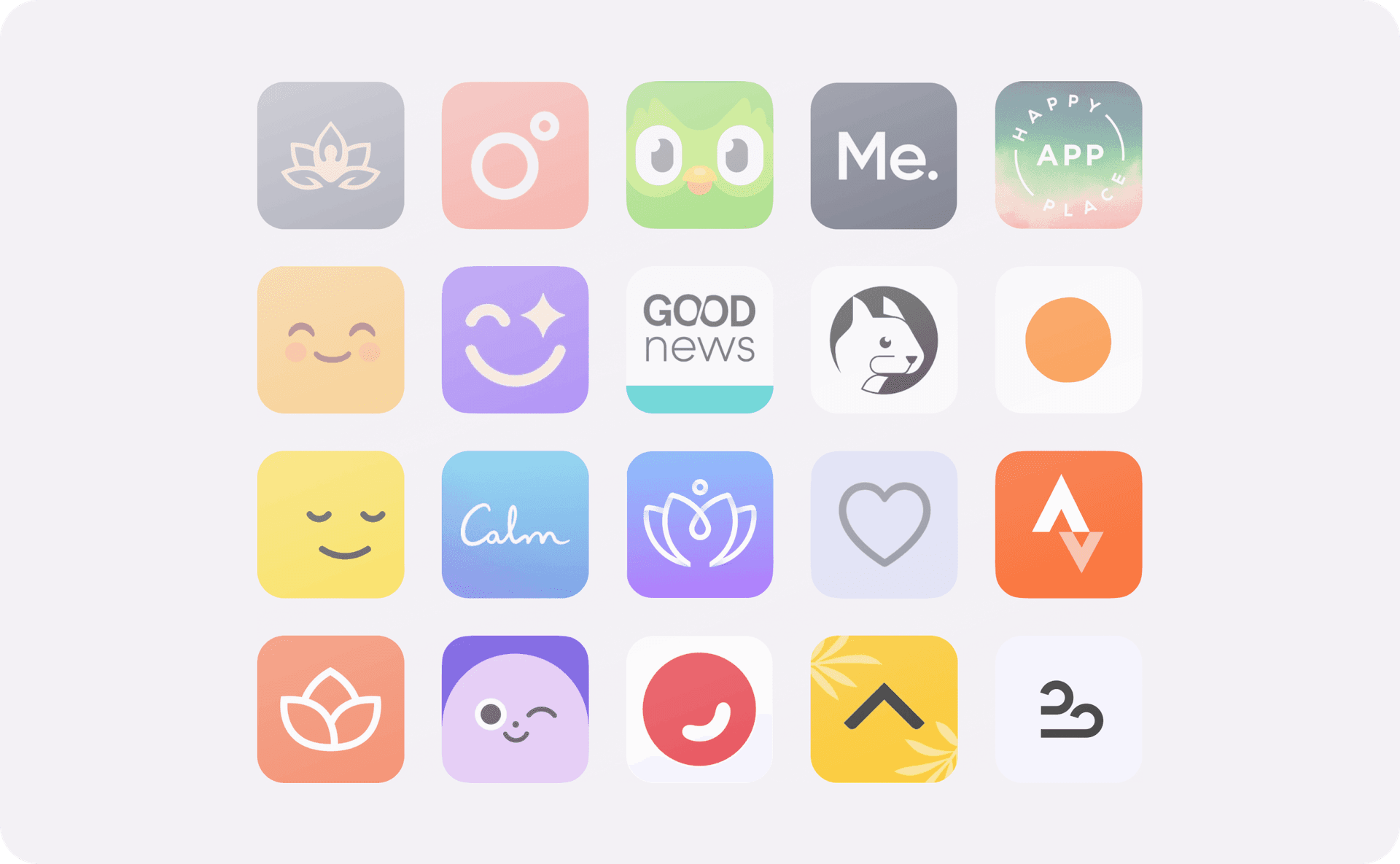
Competitor analysis
For competitor analysis I conducted an in-depth evaluation of similar apps on market and recommended apps on forum social networks as Reddit. This analysis involved assessing their features, user experiences, strengths and weaknesses.
Based on the results of analysing and testing competitive apps, I have identified the must-have features, as well as the features that were missing in the apps on the market but demanded by users.
The main drawbacks were that the content within the app is often too generalised and does not take into account individual user needs. Another disadvantage was the monotony of content: Many apps offered limited unidirectional content. Over time, users may lose interest due to the monotony of content.
Research
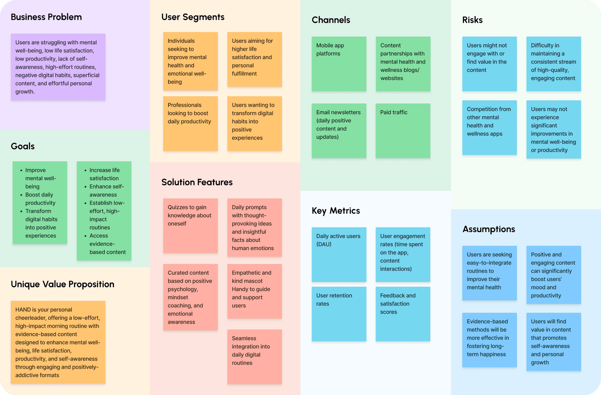
Lean UX Canvas
Later we created a canvas to organise all the information we needed to know about the mental wellbeing industry, our audience and their issues and needs, similar applications and more. This helped us to structure our knowledge and understand what we needed to focus on when looking for solutions.
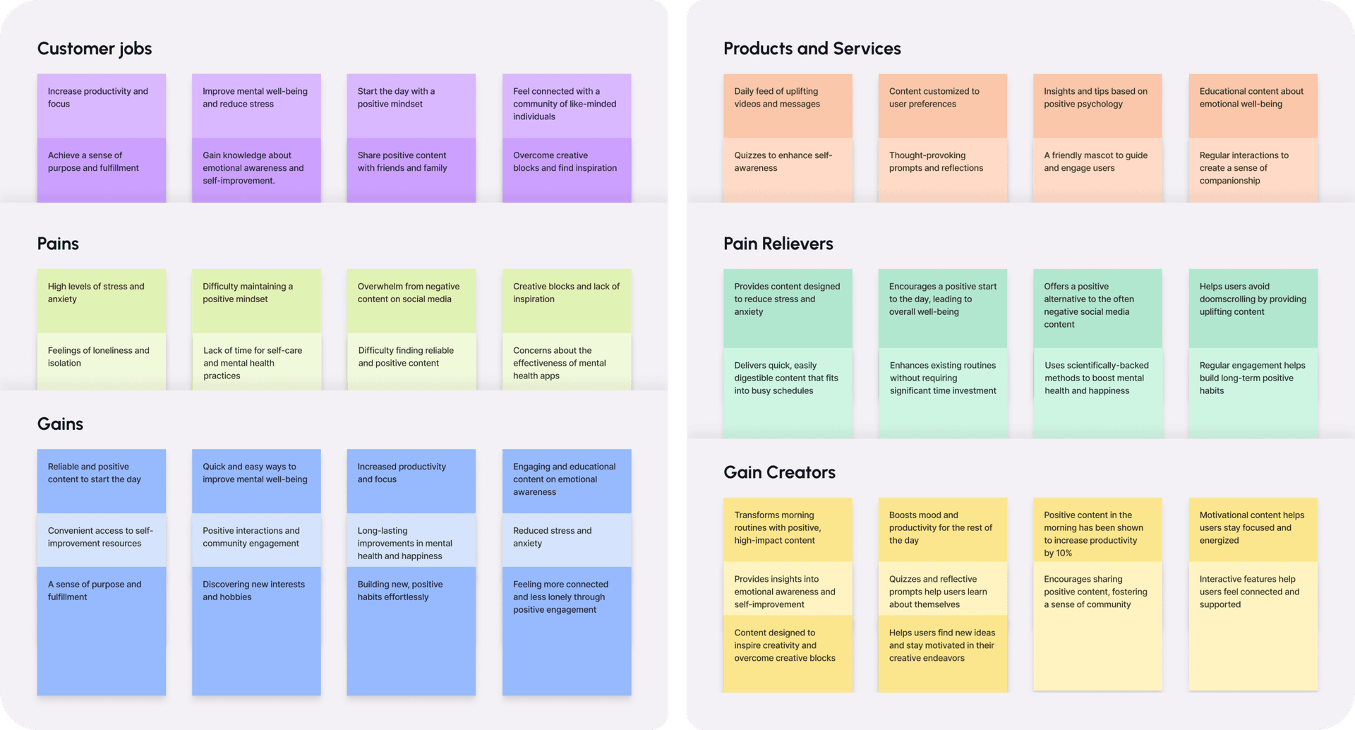
Value proposition canvas
I used the value proposition canvas to determine the user’s main pains, gains, and jobs to be done. The main takeaway is that everything is connected to the mind, body, and spirit in some way.
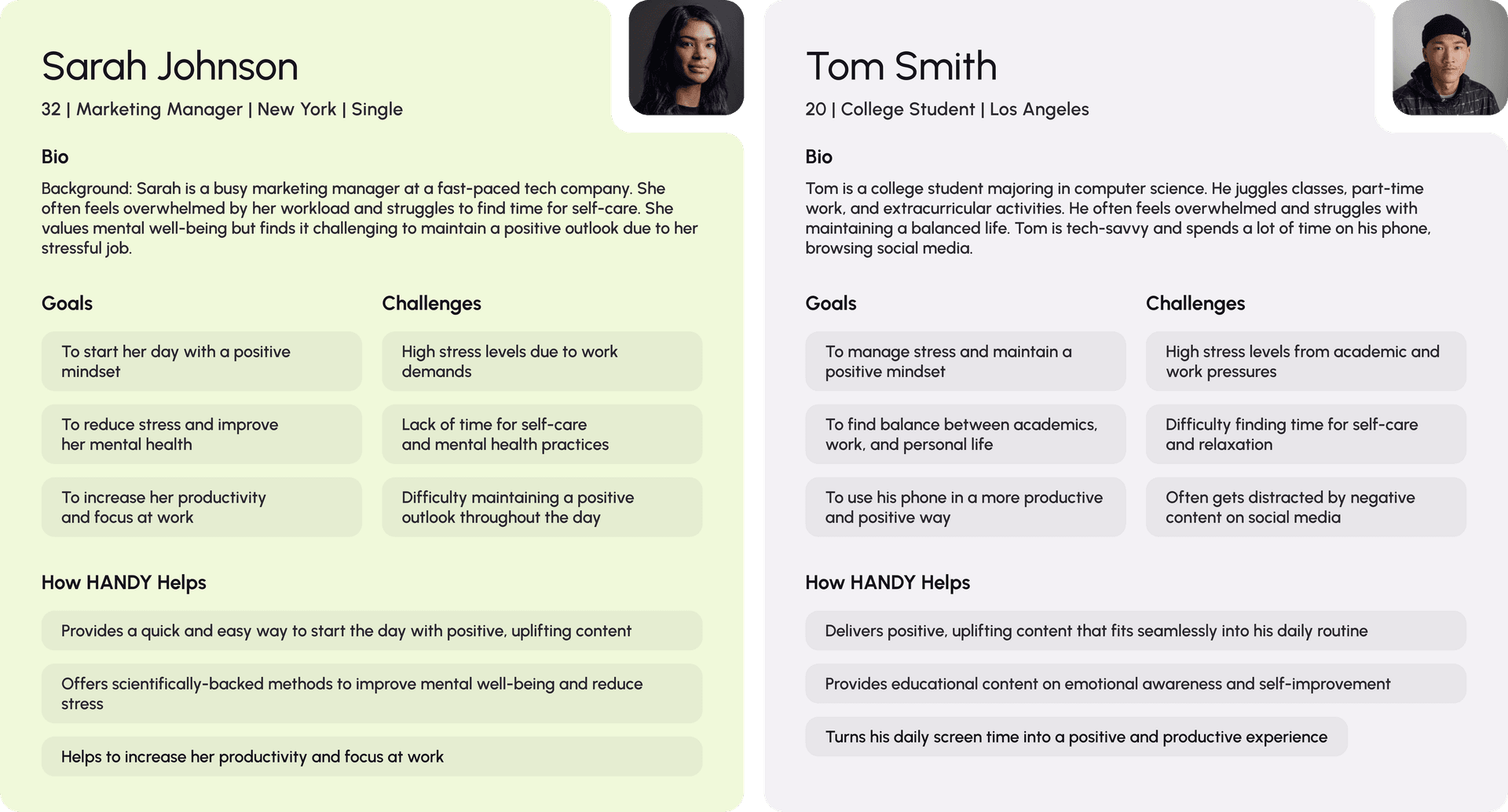
User Personas
Then I created two user personas to guide my understanding of what the users are looking for.
The primary persona is Sarah the Marketing Manager. She is often feels overwhelmed by her workload and struggles to find time for self-care. She values mental well-being but finds it challenging to maintain a positive outlook due to her stressful job. So she needs a quick and easy way to reduce stress and increase her productivity.
The secondary user persona is Tom the college student. He juggles classes, part-time work, and extracurricular activities. He often feels overwhelmed and struggles with maintaining a balanced life. Tom is tech-savvy and spends a lot of time on his phone, browsing social media. So our app must provide educational, positive, uplifting content that fits seamlessly into his daily routine. way.
Design
Prototyping
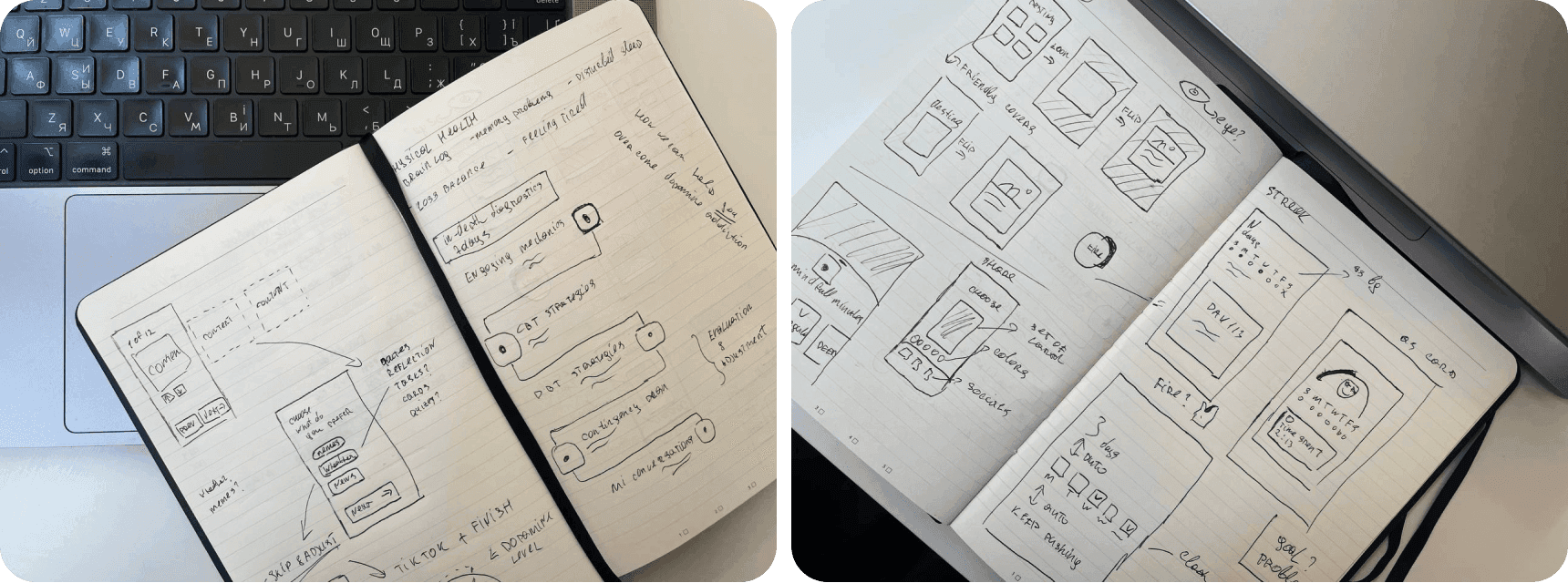
We developed a simple functionality for our app. Designed to bring users a daily dose of positive emotions, our app included a set of cards with various content. We chose the most easily implementable elements, such as motivational quotes, horoscopes, memes, positive weather forecasts, and good news. The goal of creating the MVP was to test our hypotheses with a real audience and lay the groundwork for further improvements and feature expansions.
MVP
All content was presented in a format similar to TikTok, but with an important feature: it was finite and aimed to get rid of endless “doom scrolling”. This meant that users could get their dose of positive content without the risk of getting stuck in the app for long periods of time, which is often the case with other social platforms.
In the end, Handy was intended to be an aggregator of the best existing features in similar apps on the market. Our app was to fulfil people’s demand for a boost of positive emotions at the beginning of the day, to get a dose of dopamine or to help distract themselves in moments of anxiety. Every day the user would receive a portion of positive content, as well as simple tests to get to know themselves a little better. Instead of negative and aimless empty content or content that makes you feel anxious and vulnerable, it would be a “cosy” app with content that helps you feel better about yourself.
Starting up
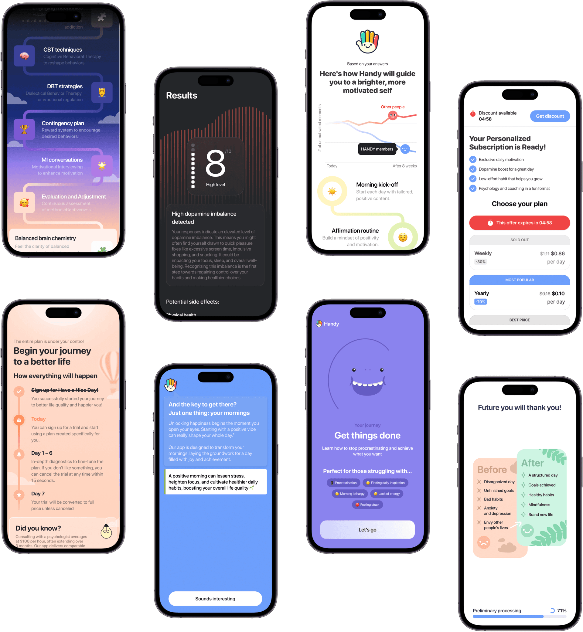
In the initial stage, we focused on analyzing our target audience and assessing our ability to attract them. One of our primary tasks was to acquire traffic and determine the feasibility of attracting subscribers at a moderate cost.
We began with basic steps: audience segmentation, geographic targeting, age group analysis, creating creatives, and optimizing clicks. These actions allowed us to gather initial data and set up advertising campaigns to attract the app’s first users.
We then moved on to experiments to make our sales funnel as effective as possible. We tested various special offers, adjusted focal points at different stages of the funnel, and tried dozens of different styles and messages. This approach helped us understand which methods worked best and what changes were needed to improve conversion rates.
Once we had the results from the initial tests, we concentrated on audience retention. Our goal was not only to have users download the app but also to ensure they returned after the trial period and continued using it.
Bare minimum design system
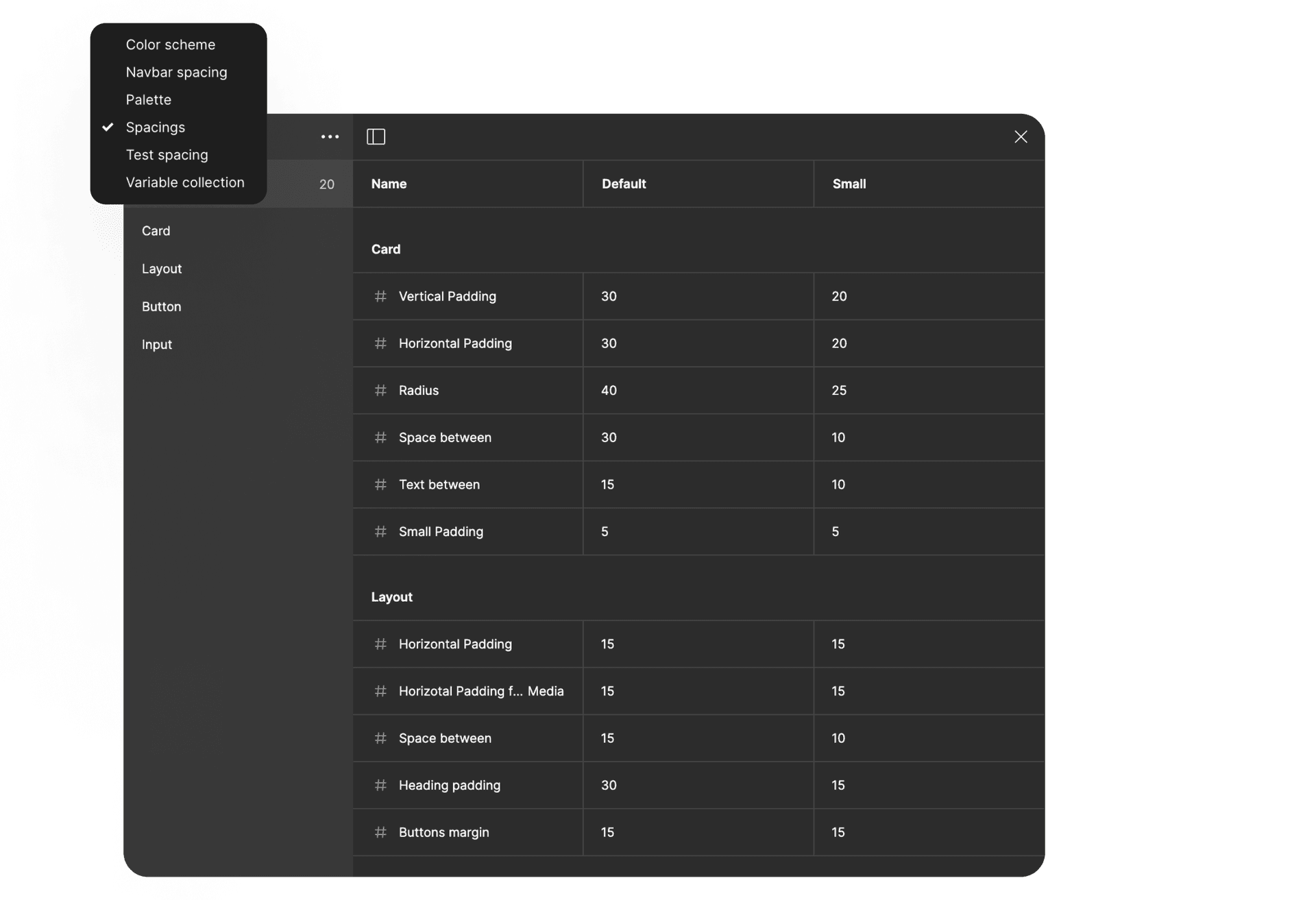
A design system can be an expensive investment, so it is crucial to understand when its use is justified and when it is not. I was responsible for the design system, maintaining it at a sufficient level to allow for the quick implementation of new features and content elements. The development team initially struggled with understanding how to work with the design system, so I taught them how to use tokens and link them, enabling them to utilize the system more quickly and efficiently.
Value through various types of content
The management approved a series of functional enhancements and experiments aimed at optimizing user engagement with our app. Our task was to develop and test new features, as well as lay the groundwork for future improvements and experiments.
User feedback
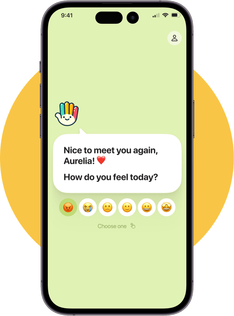
One of our app’s goals was to create a sense of care and support by maintaining a continuous dialogue with users. We decided to implement a feature allowing users to interact with our app’s mascot, Handy, who not only asks questions about their mood and well-being but also provides narratives throughout the day. This solution helped us increase user engagement and receive regular feedback for improving the app.
Checkup tests
To better understand the needs of each individual user and provide the most relevant content, we implemented the Checkup Tests functionality. These tests consist of a series of simple questions designed to assess the user’s current state and identify their strengths and weaknesses in various areas of life, similar to a “wheel of balance.” This made interaction with the app more personalized and effective.
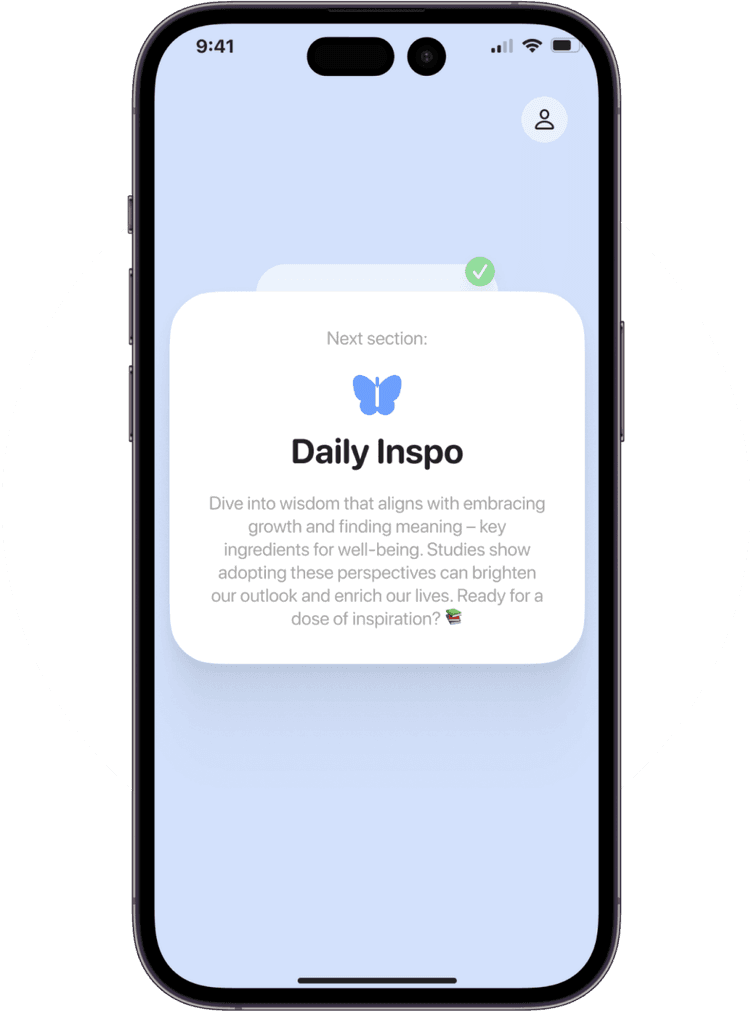
Daily sections
As the volume of content in our app grew, there arose a need to maintain its user-friendliness. To organize the content systematically, we introduced the Daily Inspiration section with subsections. This allowed us to provide a more intuitive and enjoyable interaction with the app, without overwhelming the user and encouraging them to consume more content.
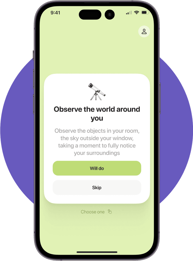
Mental quiz
Working on mental health is not just about activities within the app but also about fostering “eco-friendly” interactions with the surrounding world. The goal of our app as a whole, and this feature in particular, is to help users develop a positive perception of the world around them. To achieve this, we developed the Mental Quiz — a kind of quest that encourages users to notice and record joyful moments in their daily lives.
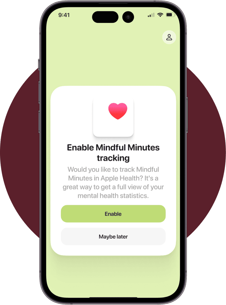
Mindful minutes
During the collection and analysis of user feedback, we discovered that many of our users utilize Apple Health to track various health metrics. We concluded that our app is well-suited for integration with Apple Health to track Mindful Minutes. Systematically tracking Mindful Minutes simplifies the process of monitoring progress towards improving mental health and helps maintain the regularity of mindfulness practices. Therefore, integrating with Apple Health will enhance user engagement with our app.
Gamification inbound
One of the key areas of development for our app was the implementation of gamification mechanics. Gamification significantly increases user engagement by encouraging them to interact with the app more frequently and return to it, motivating them to achieve their goals and improve their mental health. My task was to research the best practices in the market, design, and implement the most effective gamification mechanics into our app.
Daily streaks
To encourage regular app usage and increase user motivation, we introduced the “Daily Streaks” feature — a streak system that tracks the amount of time a user spends in the app each day. The primary goal of this feature is to reward users for maintaining daily activities in the app.
And it worked! User Retention rose to the 30% mark we set as a goal from the beginning. And the completion of the days went up to 65% of the total number of users.
Session recap
I wanted to encourage people to spend more time in the app in a non-aggressive way and to show that it’s valuable to reflect on the content here, not to rush through it in a few minutes. So we’ve introduced the session recap — counter that tracks how much time user spent in each section of the feed.
The results showed a change in behaviour. About 16% of users started to stop in sections of the app more often after the release of this feature.
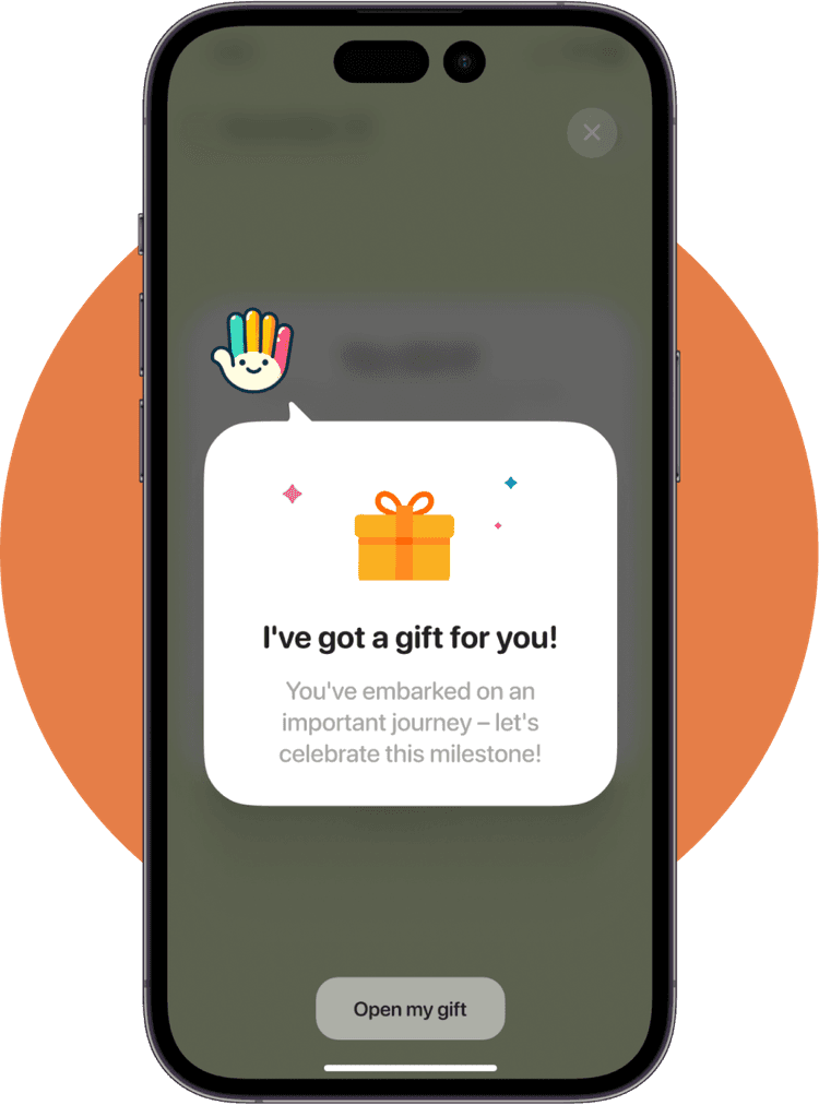
Gifts
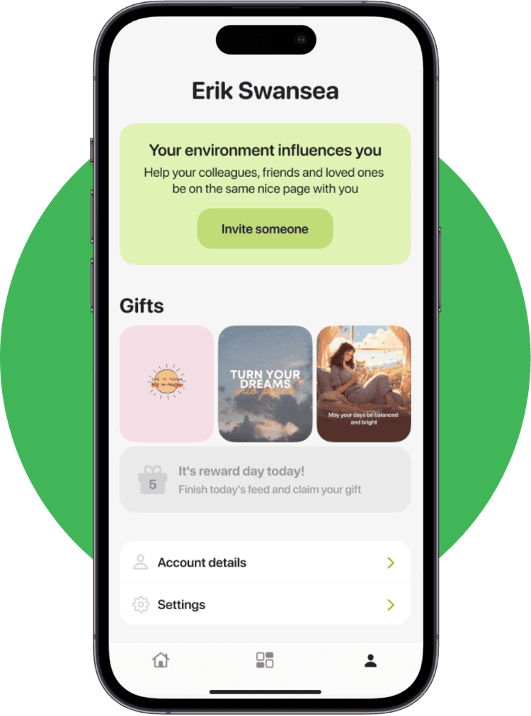
Also it’s nice for the user to get an extra nice bonus when using the app. In the initial version, streak rewards were motivational wallpapers that users could install on their mobile devices, which inspired them even outside the app.
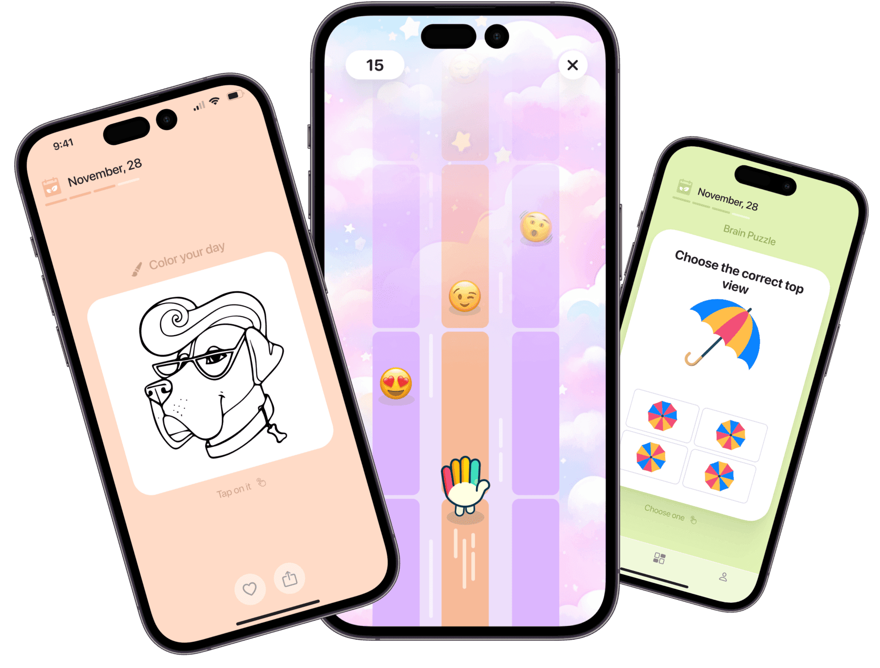
As part of our gamification experiments, we also explored and implemented various tools, such as coloring pages, simple puzzles, and endless relaxing runner games, all aimed at capturing positive emotions.
On-demand tools
The development of the toolbox is our response to the main problem with the feed, which is its “finite” nature, in other words, its limited duration for a specific day. We understand that users may need psychological support at any moment, so we created a set of tools that are always available. Implementing the toolbox has helped improve the user experience and increase user engagement.
Toolbox itself
We developed a navigation panel with quick access to the toolbox. In turn, the toolbox served as a kind of hub, representing a separate screen with all the tools for maintaining mental health. In the initial stage, the tools implemented included breathing exercises, a reflection journal, and a mood tracker.
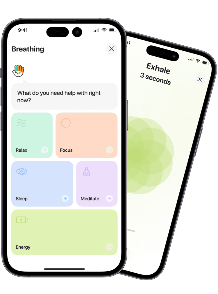
Breathing
The first tool in the toolbox was the Breathing mechanic — special techniques aimed at controlling and managing breathing. Breathing exercises are a simple and effective way to improve mental health, reduce stress and anxiety levels, and enhance overall well-being.
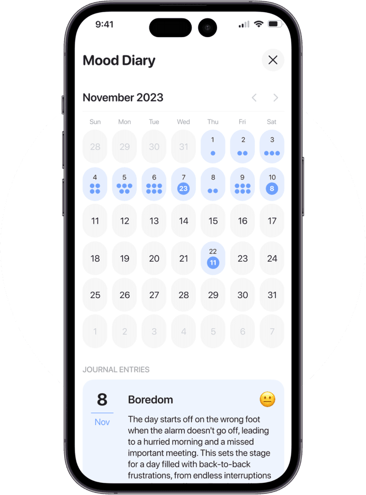
Mood Diary
The second tool introduced was the Mood Diary. It’s a useful tool for keeping a mood journal, allowing users to record their emotions and track mood changes over time for a deeper understanding of their emotional states. Additionally, a note-taking feature was added for a more detailed description of internal experiences and the factors provoking them.
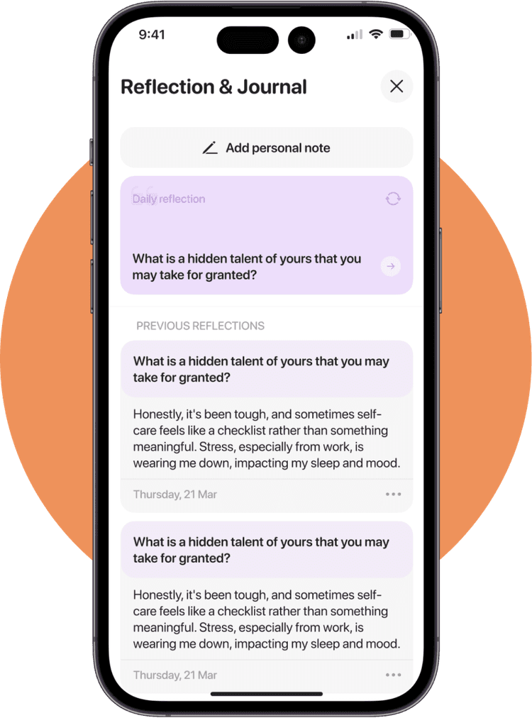
Reflection & Journal
The third tool introduced was Reflection & Journal. It’s a kind of personal diary that allows users not only to record their emotions and thoughts but also to conduct deep analysis and reflection on them. This tool is designed to help users develop self-understanding and mindfulness by expressing their thoughts and feelings without fear of judgment. Additionally, jotting down emotions and thoughts in the journal can help emotionally “unload” and release negative emotions.
Organic growth
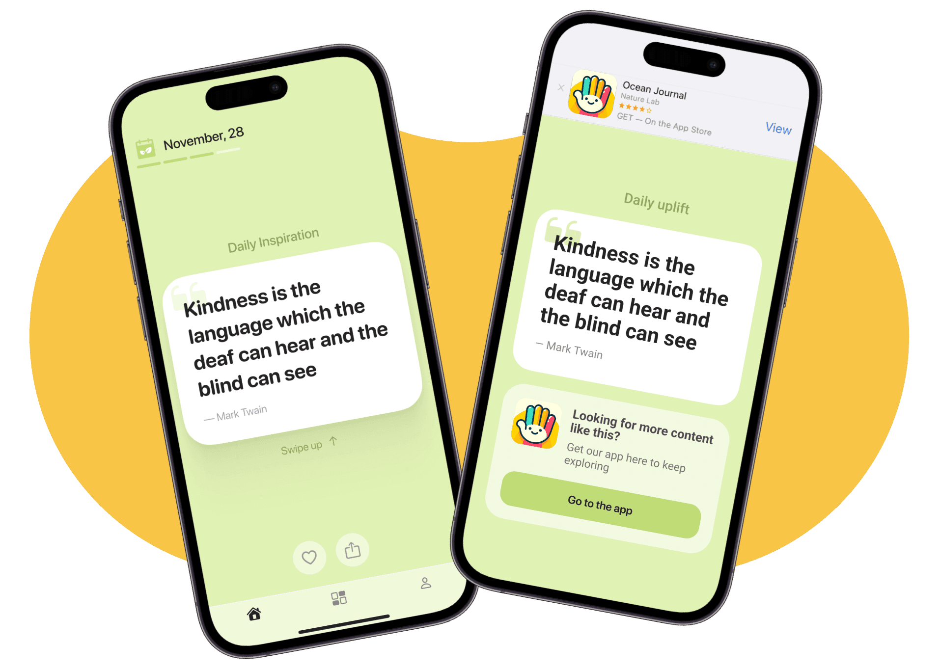
We decided to test the effectiveness of the referral system for attracting new users, so we needed to develop the basic functionality of this feature. However, we went beyond the typical implementation of a “share” button and created a web representation of the content. Our goal was not only to draw attention to this feature but also to seamlessly integrate it into the app to demonstrate the usefulness of working on one’s mental health through gifts that users can send to their friends and loved ones, improving their mood.
Gifts storage
We designated a separate space for storing gifts that users receive for achieving their streaks. This feature is designed to provide additional motivation to users and emphasize the significance of their accomplishments. Additionally, users can share these gifts with their loved ones, contributing to the increase in the number of new potential users.
Conclusion
1 month
needed to make the first MVP version of the product
~$6
average cost per install
30
types of content designed
+65%
of total users who finished the full feed at 30 day benchmark
+40%
of user retention increased


